When we set out to build Spaces, we knew we wanted sketching to be at the application’s core. In addition, we had some initial ideas of how we thought drawing could become the input method for a new building design and used for further editing. So from the outset, sketching has been in our DNA, and the further we have developed Spaces, the more power we’ve been able to add to our sketching engine.
When enhancing our sketching tools, we’re constantly referring to traditional design methods to maximise the speed at which architects can explore their creative ideas.
With our just-released version 2.2, we have taken our sketching to a new level with our interactive sketch editing.
Before we delve into that, let’s briefly examine how our sketching has evolved since our version 1 release almost a year ago.
Sketch Input
When we first launched Spaces, we introduced the concept of sketch-based input. Initially, you drew a series of strokes to design the overall look of your new design and then a simple tap turned the sketch into a building model.
Once you have a building model, you could use one of two editing modes – sketch or vector – to further change and shape the building, either across the whole building or by changing footprints on a series of building levels.
Six months after release, we made a small but significant modification where the building would be created automatically as soon as a series of strokes defined a closed shape. This feature was staring us in the face, but we needed some external perspective from a user to suggest this.
At this stage, we started thinking about how else we could speed up sketching, but we’re jumping ahead.
Sketch book
As we worked towards our version 2 release, we wanted to launch another part of our core sketching philosophy – the integrated sketchbook.
The inspiration for this development was twofold; firstly, we wanted to digitise the traditional architect’s notebook where they capture thoughts, ideas, sketch concepts etc.
The second aspect was to provide a digital equivalent to the traditional tracing paper. Allowing our customers to capture a simple 3d view and then trace their ideas over the top provides a quick and effective way to explore options. You can trace, refine, delete, and repeat as many times as you like. Then, once you’ve explored options and ideas, you can revert to Space’s modelling side and begin to implement the ideas you refined while tracing.
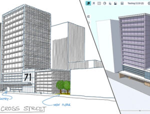
In parallel with the sketchbook development, we were also implementing Space planning, allowing a building model to be refined with the internal layout. As we were developing this, further ideas on how to make sketching even more integrated came to mind – these ideas were reinforced when we discussed them with people who visited us at the Chicago AIA trade show.
Interactive sketch editing
Now with our new 2.2 release, you no longer need to enter an ”edit mode” to edit your design.
With our new interactive sketch editor, sketch your building, keep drawing, add an extension, cut out an alcove, and reshape an edge; you can do all this and more and see your design evolve in sync with your ideas.
Once you’re happy with the overall form, you can then take another step to add more detail. Switching to our new Space tool lets you start sketching your internal layout. Divide and create Spaces; use a squiggle to remove a division and merge Spaces. Again no specialist editing mode is required – keep sketching.
As you can see in the first year since Spaces’ release, we’ve doubled down on our core belief in sketching and have many more ideas as we continue to develop Spaces.
Mer info: www.spacesapp.io


